Introduction
Outdoor hoarding design has a direct influence on how well a business is seen, remembered, and trusted in busy public environments. Across the UK, hoardings are often viewed at speed or from a distance, which means colour, font, and layout must work together instantly. A well-designed hoarding communicates its message in seconds, while a poorly designed one can easily fade into visual noise.
For businesses investing in outdoor advertising, understanding how design choices affect visibility is essential. From colour contrast and font readability to layout balance, every detail plays a role in whether an advertising hoarding delivers real value. This article explores how outdoor hoarding design visibility is shaped by thoughtful visual decisions and why professional design support helps UK businesses achieve more substantial brand presence in high-traffic locations.
Why Outdoor Hoarding Design Matters in the UK Market
Outdoor advertising design is essential in the UK, where high streets, road networks, and commercial developments are visually competitive. Hoardings often compete with shopfronts, vehicles, street furniture, and digital signage, making clarity essential.
Many businesses find that effective hoarding design improves brand recognition simply because the message is easier to process. When colour, font, and layout are aligned, advertising hoardings remain legible and impactful even during brief viewing moments. This consistency supports long-term outdoor brand awareness marketing rather than relying on one-off impressions.
Colour Choices and Outdoor Hoarding Design Visibility
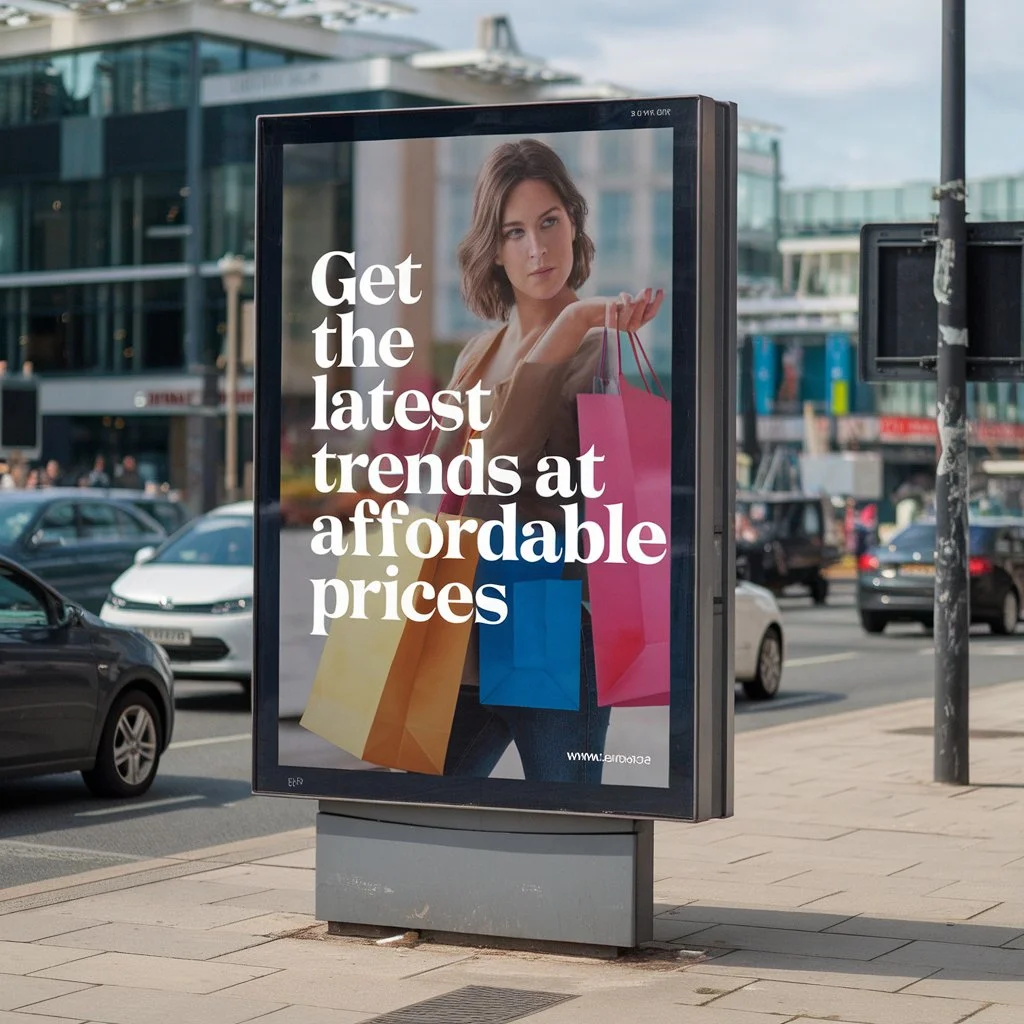
Colour selection for hoardings has a significant impact on how quickly a message is noticed. High-contrast colour combinations generally perform best outdoors, particularly in changing light conditions common across the UK. However, effective colour use is not about brightness alone; it must also support brand identity and readability.
The best colours for outdoor advertising hoardings balance visibility with professionalism. Colours that clash with surroundings can work well, but only when used thoughtfully. When colour supports both message clarity and brand recognition, outdoor hoarding design becomes far more effective.

Fonts That Work in Real-World Outdoor Conditions
Readable fonts for hoardings are critical because outdoor messages are rarely read slowly. The best font size for hoardings depends on viewing distance, traffic speed, and placement height, but simplicity is always key.
Clean, bold typefaces ensure messages remain legible even when viewed briefly. Decorative fonts may look appealing in digital designs, but often underperform outdoors. Many UK businesses find that straightforward typography not only improves readability but also reinforces trust and professionalism in outdoor advertising design.
Layout and Visual Hierarchy in Hoarding Design
Layout determines how quickly a message is understood. Even with intense colours and fonts, a cluttered layout can reduce impact. Effective hoarding design uses visual hierarchy to guide the viewer’s eye naturally from the main message to supporting details.
Spacing, alignment, and proportion all contribute to clarity. A well-structured layout ensures the message feels confident rather than overwhelming. This is particularly important for large-format outdoor advertising, where simplicity often delivers stronger results than excessive detail.
Creativity Without Compromising Clarity
Creative hoarding design is most successful when it enhances communication rather than distracting from it. High-impact outdoor advertising often relies on one strong idea supported by clean visuals and minimal text.
Many businesses discover that restraint improves effectiveness. When creativity is aligned with clear messaging, advertising hoardings stand out while remaining easy to understand. This balance helps outdoor advertising creatives remain memorable without sacrificing readability or brand consistency.
Real-World Impact of Strong Outdoor Advertising Design
Well-executed outdoor advertising design often delivers consistent exposure over time. Even a single hoarding in a high-traffic area can reinforce brand presence daily, supporting wider visual marketing solutions.
UK businesses frequently notice improved recognition when hoardings are designed professionally and maintained well. Over time, repeated exposure builds familiarity, which plays a vital role in audience engagement and long-term brand recall.
Design Longevity and Material Quality
Design impact is closely linked to material durability. Outdoor hoarding design must withstand weather, sunlight, and pollution while maintaining clarity. Fading colours or peeling graphics can undermine even the strongest design concept.
Durable outdoor signage materials help preserve colour accuracy and text clarity throughout the campaign. When materials are chosen correctly, hoardings continue to represent the brand professionally for the whole duration of their display.

Avoiding Common Hoarding Design Pitfalls
Some hoardings fail to perform not because of location, but due to avoidable design decisions. Overcrowded layouts, low-contrast colour combinations, or fonts that are too small can significantly reduce visibility.
Understanding hoarding visibility design tips allows businesses to make informed choices that maximise the value of their advertising space. Thoughtful design prevents wasted impressions and ensures outdoor advertising works as intended.
The Value of Professional Design Guidance
Many businesses feel more confident when experienced professionals support outdoor hoarding design decisions. Expert guidance ensures colour, font, and layout choices are suited to real-world viewing conditions rather than screen-based assumptions.
Professional input simplifies the process and helps businesses achieve consistent, effective results. This approach ensures outdoor advertising design aligns with brand goals while delivering strong visibility in competitive environments.
Conclusion
Effective outdoor hoarding design depends on the careful balance of colour, font, and layout to deliver clear messages in high-traffic spaces, whether used for temporary and permanent hoardings. When these elements work together, hoardings become powerful tools for long-term brand visibility rather than short-lived displays.
Magenta Signs provides transparent, high-quality, and personalised signage solutions for businesses across the UK. Book your free consultation today and discover the perfect signage and vehicle wrap solutions to elevate your business.